Custom UI
You can display custom user interface (UI) components using the
@metamask/snaps-sdk module when
implementing the following features:
To use custom UI, first install @metamask/snaps-sdk
using the following command:
yarn add @metamask/snaps-sdk
Then, whenever you're required to return a custom UI component, import the components from the
SDK and build your UI with them.
For example, to display a panel using snap_dialog:
import { panel, heading, text } from "@metamask/snaps-sdk";

await snap.request({
  method: "snap_dialog",
  params: {
    type: "alert",
    content: panel([
      heading("Alert heading"),
      text("Something happened in the system."),
    ]),
  },
});
Components
The following custom UI components are available:
address
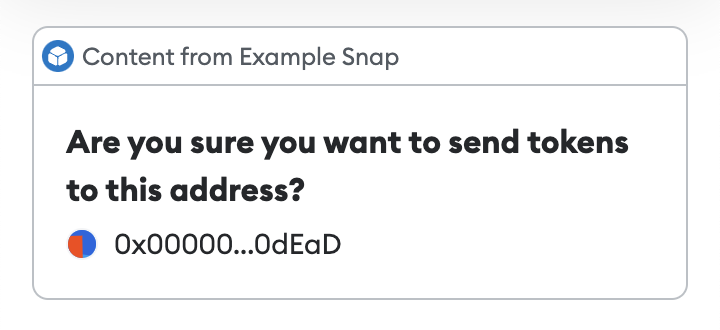
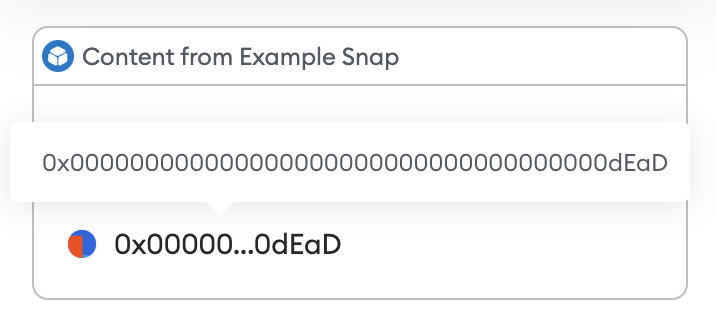
Outputs a formatted text field for an Ethereum address. The address is automatically displayed with a jazzicon and truncated value. Hovering the address shows the full value in a tooltip.
Example
import { panel, heading, address } from "@metamask/snaps-sdk";

await snap.request({
  method: "snap_dialog",
  params: {
    type: "alert",
    content: panel([
      heading("Are you sure you want to send tokens to this address?"),
      address("0x000000000000000000000000000000000000dEaD"),
    ]),
  },
});
button
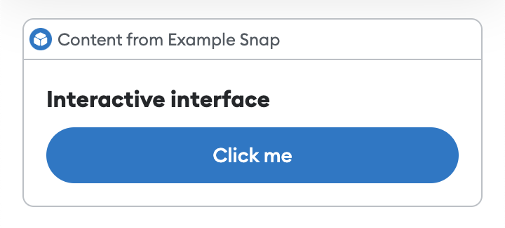
Outputs a button that the user can select. For use in interactive UI.
Parameters
An object containing:
value:string- The text of the button.buttonType:string- (Optional) Possible values arebuttonorsubmit. The default isbutton.name:string- (Optional) The name that will be sent toonUserInputwhen a user selects the button.variant- (Optional) Determines the appearance of the button. Possible values areprimaryorsecondary. The default isprimary.
Example
import { button, panel, heading } from "@metamask/snaps-sdk";

const interfaceId = await snap.request({
  method: "snap_createInterface",
  params: {
    ui: panel([
      heading("Interactive interface"),
      button({
        value: "Click me",
        name: "interactive-button",
      }),
    ]),
  },
});

await snap.request({
  method: "snap_dialog",
  params: {
    type: "Alert",
    id: interfaceId,
  },
});
copyable
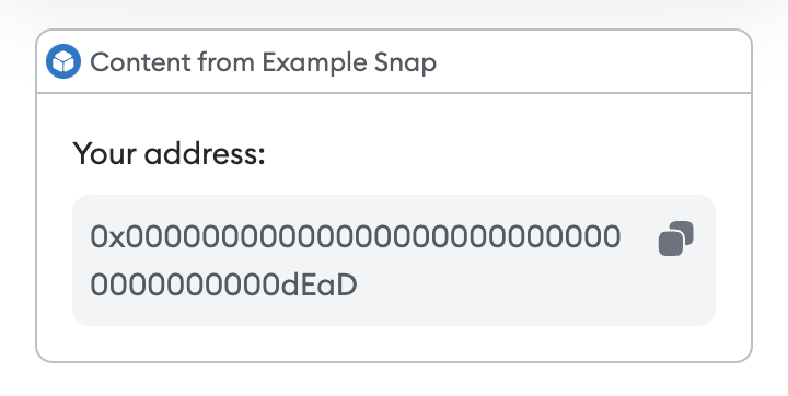
Outputs a read-only text field with a copy-to-clipboard shortcut.
Example
import { text, copyable } from "@metamask/snaps-sdk";

await snap.request({
  method: "snap_dialog",
  params: {
    type: "alert",
    content: panel([
      text("Your address:"),
      copyable("0x000000000000000000000000000000000000dEaD"),
    ]),
  },
});
divider
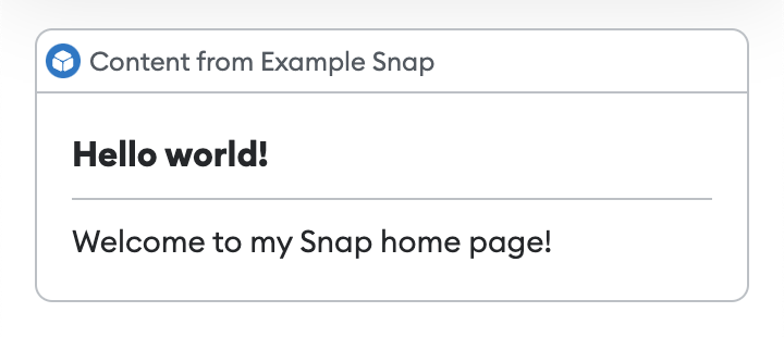
Outputs a horizontal divider.
Example
import type { OnHomePageHandler } from "@metamask/snaps-sdk";
import { panel, divider, text } from "@metamask/snaps-sdk";

module.exports.onHomePage = async () => {
  return {
    content: panel([
      heading("Hello world!"),
      divider(),
      text("Welcome to my Snap home page!"),
    ]),
  };
};
form
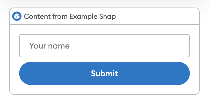
Outputs a form for use in interactive UI.
Parameters
An object containing:
name:string- The name that will be sent toonUserInputwhen a user interacts with the form.children:array- An array ofinputorbuttoncomponents.
Example
import { input, button, form } from "@metamask/snaps-sdk";

const interfaceId = await snap.request({
  method: "snap_createInterface",
  params: {
    ui: form({
      name: "form-to-fill",
      children: [
        input({
          name: "user-name",
          placeholder: "Your name",
        }),
        button({
          value: "Submit",
          buttonType: "submit",
        }),
      ],
    }),
  },
});

await snap.request({
  method: "snap_dialog",
  params: {
    type: "Alert",
    id: interfaceId,
  },
});
heading
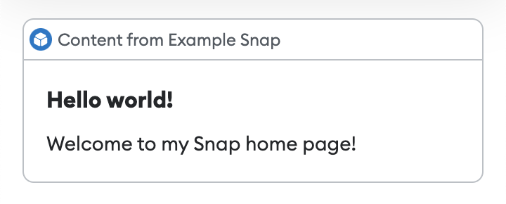
Outputs a heading.
This is useful for panel titles.
Example
import type { OnHomePageHandler } from "@metamask/snaps-sdk";
import { panel, heading, text } from "@metamask/snaps-sdk";

module.exports.onHomePage = async () => {
  return {
    content: panel([
      heading("Hello world!"),
      text("Welcome to my Snap home page!"),
    ]),
  };
};
image
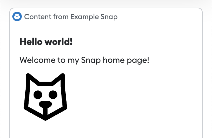
Outputs an image. This component takes an inline SVG. It does not support remote URLs.
You can import SVG, PNG, and JPEG files using an import statement.
These files are automatically imported as SVG strings, so you can pass them directly to the image component.
The SVG is rendered within an <img> tag, which prevents JavaScript or interaction events from
being supported.
To disable image support, set the features.images
configuration option to false.
The default is true.
Example
import type { OnHomePageHandler } from "@metamask/snaps-sdk";
import { panel, heading, text, image } from "@metamask/snaps-sdk";
import svgIcon from "./path/to/icon.svg";

module.exports.onHomePage = async () => {
  return {
    content: panel([
      heading("Hello world!"),
      text("Welcome to my Snap home page!"),
      image(svgIcon),
    ]),
  };
};
input
Outputs an input component for use in interactive UI.
Parameters
An object containing:
name:string- The name that will be used as a key to the event sent toonUserInputwhen the containing form is submitted.inputType:string- (Optional) Type of input. Possible values aretext,number, orpassword. The default istext.placeholder:string- (Optional) The text displayed when the input is empty.label:string(Optional) The text displayed alongside the input to label it.value:string(Optional) The default value of the input.
Example
import { input, form } from "@metamask/snaps-sdk";

const interfaceId = await snap.request({
  method: "snap_createInterface",
  params: {
    ui: form({
      name: "form-to-fill",
      children: [
        input({
          name: "user-name",
          placeholder: "Your name",
        }),
        button({
          value: "Submit",
          buttonType: "submit",
        }),
      ],
    }),
  },
});

await snap.request({
  method: "snap_dialog",
  params: {
    type: "Alert",
    id: interfaceId,
  },
});

See the @metamask/images-example-snap
package for a full example of implementing images.
panel
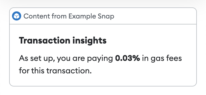
Outputs a panel, which can be used as a container for other components. This component takes an array of custom UI components.
Example
import type { OnTransactionHandler } from "@metamask/snaps-sdk";
import { panel, heading, text } from "@metamask/snaps-sdk";

module.exports.onTransaction = async ({ transaction }) => {
  const gasFeesPercentage = /* Calculate gas fees percentage */;
  return {
    content: panel([
      heading("Transaction insights"),
      text(
        `As set up, you are paying **${gasFeesPercentage.toFixed(
          2,
        )}%** in gas fees for this transaction.`,
      ),
    ]),
  };
};
row
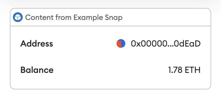
Outputs a row with a label and value, which can be used for key-value data.
The label must be a string. The value can be a child component of type
text or address.
Example
import { panel, row, text, address } from "@metamask/snaps-sdk";

await snap.request({
  method: "snap_dialog",
  params: {
    type: "alert",
    content: panel([
      row("Address", address("0x000000000000000000000000000000000000dEaD")),
      row("Balance", text("1.78 ETH")),
    ]),
  },
});
spinner
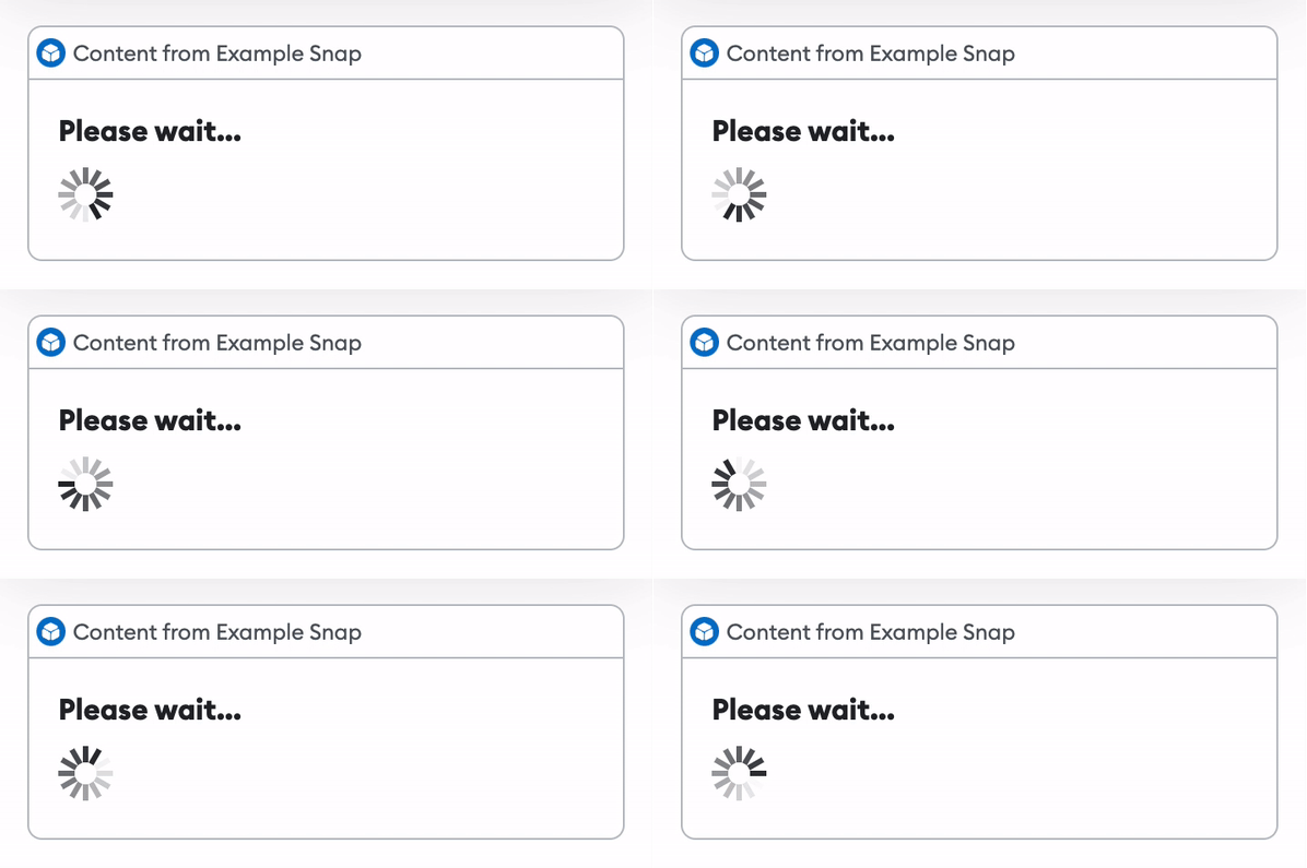
Outputs a loading indicator.
Example
import { panel, heading, spinner } from "@metamask/snaps-sdk";

await snap.request({
  method: "snap_dialog",
  params: {
    type: "alert",
    content: panel([
      heading("Please wait..."),
      spinner(),
    ]),
  },
});
text
Outputs text.
Example
import type { OnHomePageHandler } from "@metamask/snaps-sdk";
import { panel, heading, text } from "@metamask/snaps-sdk";

module.exports.onHomePage = async () => {
  return {
    content: panel([
      heading("Hello world!"),
      text("Welcome to my Snap home page!"),
    ]),
  };
};

Markdown
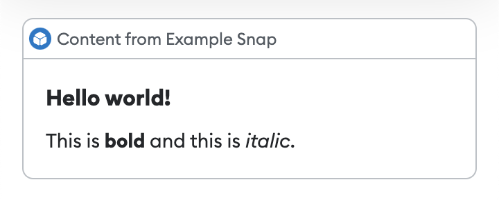
text components accept bold and italic inline Markdown.
Example
import { panel, heading, text } from "@metamask/snaps-sdk";

await snap.request({
  method: "snap_dialog",
  params: {
    type: "alert",
    content: panel([
      heading("Hello world!"),
      text("This is **bold** and this is _italic_."),
    ]),
  },
});
Links
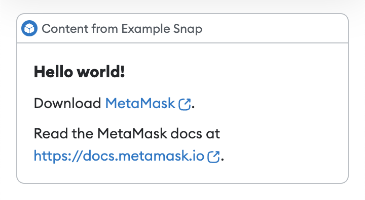
text components accept inline links.
Example
import type { OnHomePageHandler } from "@metamask/snaps-sdk";
import { panel, text } from "@metamask/snaps-sdk";

module.exports.onHomePage = async () => {
  return {
    content: panel([
      heading("Hello world!"),
      text("Download [MetaMask](https://metamask.io)."),
      text("Read the MetaMask docs at [](https://docs.metamask.io)."),
    ]),
  };
};
Emojis
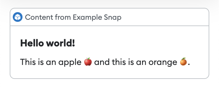
Text-based components (such as heading and text) accept emojis.
Example
import { panel, heading, text } from "@metamask/snaps-sdk";

await snap.request({
  method: "snap_dialog",
  params: {
    type: "alert",
    content: panel([
      heading("Hello world!"),
      text("This is an apple 🍎 and this is an orange 🍊."),
    ]),
  },
});
Examples
See the following packages for full examples of implementing custom UI: